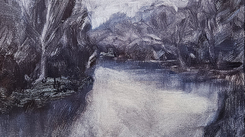
Featured on Canadian Art Today, Interview with Artists in Canada
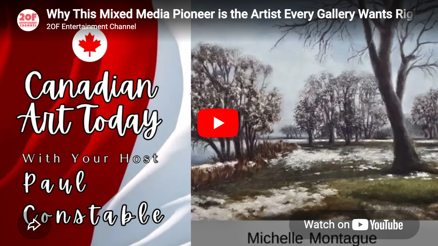
Recently, I was interviewed by Paul Constable on Canadian Art Today, EP 1017, where we spoke about my approach to landscape paintings and the inspiration behind my current body of work.
You can read more about the episode here. Watch this inspiring conversation about art, identity, nature, and creative renewal on Canadian Art Today.
About Artists in Canada
Artists In Canada was formed in 2000 to better connect Canadian artists – from urban haunts to rural settings to the most remote places in our north – with the rest of Canada and the world.
Video Update: Empty Spaces (Marie Curtis Park looking southwest)
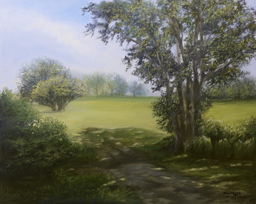
Empty spaces (Marie Curtis Park looking southwest) – Aug 2020
I’ve posted my video documenting my painting session of the work titled, Empty Spaces (Marie Curtis Park looking southwest). You can watch the video on my blog.
This work is part of the The View From Here series.
Painting Empty Spaces (Marie Curtis Park looking southwest) | video
This painting was created sometime last year in 2020, during the first pandemic lock-down due to the COVID-19 virus. So the piece and what I was feeling during its creation was affected by the experience at that time. The scene is based on my memory of previous visits to the park over the years, sketches and photographs. As I look back on this painting, I wonder how I will view this and my other works created during this time 10, or maybe 20 years later.
Like many others, I feel, that everything created during the pandemic, will be more reflective, perhaps taking on an intimate, emotional, or societal view as we continue to experience the pandemic’s affects.
In my work, I try to find inspiration in my immediate surroundings – in Nature, or family, or friends. I’m interested in communicating a sense of place, a time of day, or a feeling such as the warmth of a sunset. Establishing a connection with the viewer. And this painting is no different in that aspect.
This painting is part of a larger series, depicting various scenes of Marie Curtis Park, which is located in Toronto (Canada). Marie Curtis Park is nestled in the city’s west-end, on Lake Ontario. The park has an abundance of small wildlife and native plants. It has a beach, it’s also connected to bike and walking trails and I find it’s a nice spot for viewing migratory birds.
To see the other paintings in this series take a look at The View From here.
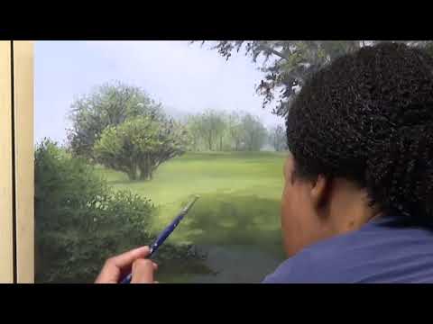
Watch me paint the Light at the Edge of the Forest
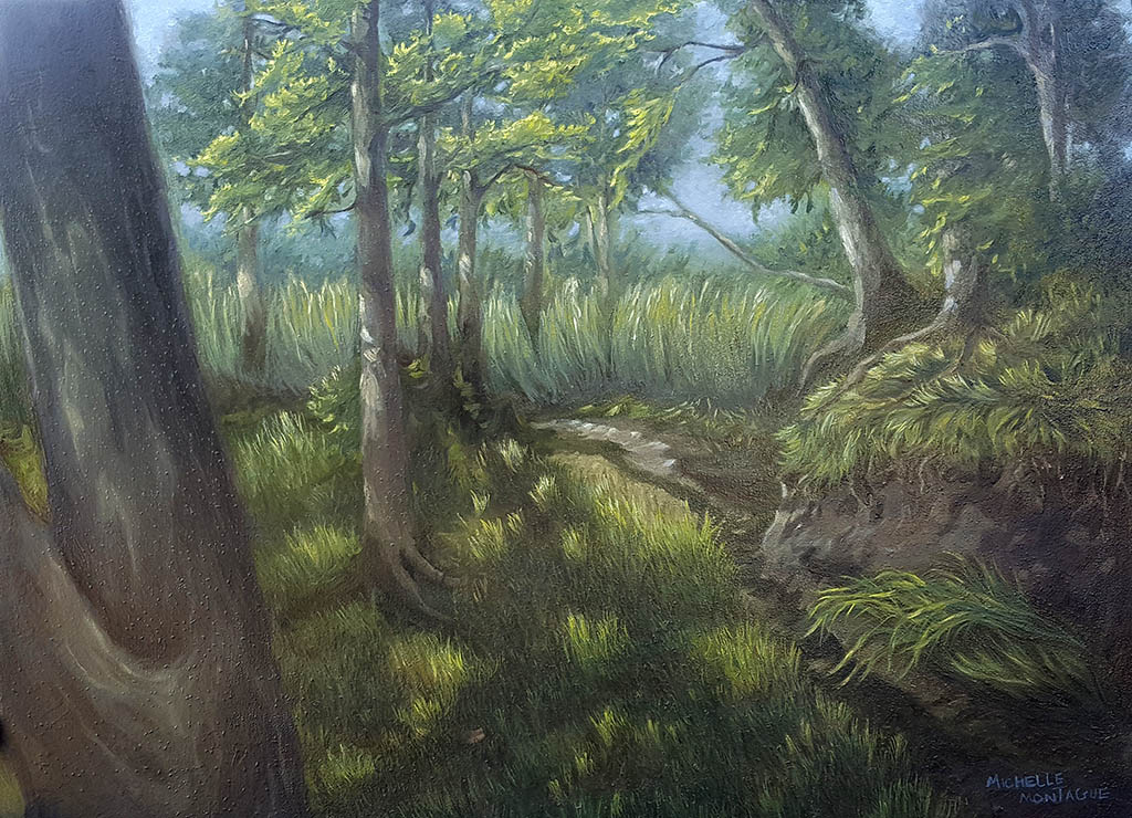
The Light at the Edge of the Forest – Sep 2020
I’ve posted my video documenting my painting session of the work titled, The Light at the Edge of the Forest. Watch the video on my blog.
This work is part of the Wild Imperfections series.
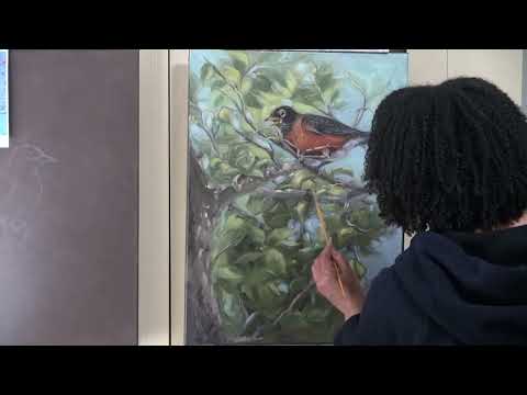
Watch me paint Our Neighbour, the American Robin
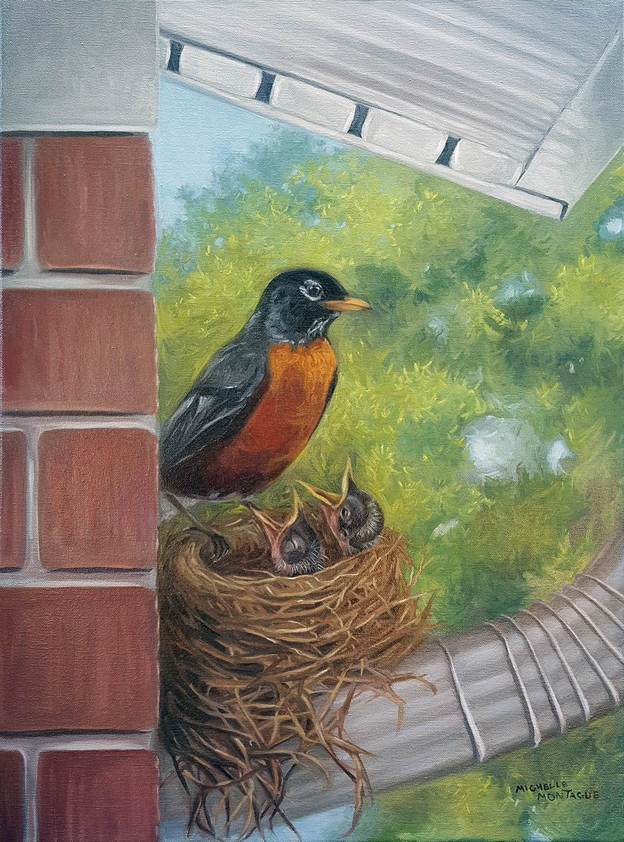
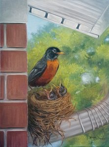
Our Neighbour, the American Robin – June 2020
I’ve posted my second video documenting my painting session of the work titled, Our Neighbour, the American Robin. Watch the video on my blog.
This work is part of the Wild Imperfections series.
Painting Our Neighbour, the American Robin | video
Our Neighbour, the American Robin is the second of a two-panel painting (also known as a diptych). Created using oil paints on a 18″x24″ canvas, this piece took me about 1 week complete. And since this is the second panel, I started off by drawing a rough sketch of the Robin’s nest just so that I have an idea of its placement in relation to the subject in the first panel.
After observing robins for a few years, I’ve come to appreciate how resourceful they are. For example, the nest depicted in this painting was built on the downspout of my neighbour’s house and stood intact for four years – until the home owner finally decided to take it down after it was abandoned. I’ve seen this nest withstand wind gusts of up to 90 km/h and weathered many storms – while the female robin was sitting on it! Each year a robin returned, she would add new twigs, and grass to it, in preparation to lay her eggs. After the babies have hatched and left the nest, sparrows would take bits and pieces from it to build their own. I’ve seen three generations of robins hatch in this nest and was I amazed with each experience.
This work is part of the Wild Imperfections series.
If you want to see how I painted the first panel, check out my previous video.
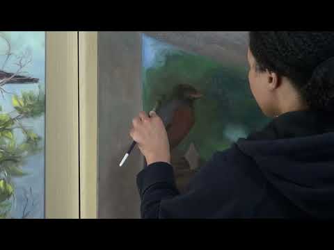
Watch me paint the American Robin
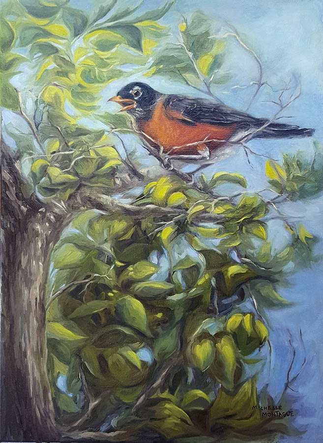
American Robin – May 2020
I’ve posted my first video documenting my painting session of the work titled, American Robin. During this time I learned about the editing process: camera, music, voice over, titles, the whole deal. There’s so much more to learn.
This work is part of the Wild Imperfections series.
Painting the American Robin | video
American Robin took me about 30 hrs to complete and has gone through quite the evolution. The bird in this oil painting was inspired by an actual Robin that nests in my backyard.
My vision for this painting was to have the Robin perched atop a tree. I want the painting to have a feeling of movement and colour. Imagine being out on a walk in the morning, the sun has already risen, the air is warm, but slightly breezy. The world is awake. Sounds of Cardinals, Finches, Starlings, Chickadees and Sparrows fill the air, but it’s the American Robins greeting that gets my attention today and is my inspiration for this art piece. Having observed Robins for a few years, I’ve come to enjoy and appreciate these industrious birds from their nest building skills to how they nurture their young.
This is my first video, so I’m still trying figure out the ideal set-up for film and editing, so there will be some instances where I’m blocking the shot – but I sincerely tried my best and I’m still learning.
This work is part of the Wild Imperfections series.
Mere Bodies or Something More?
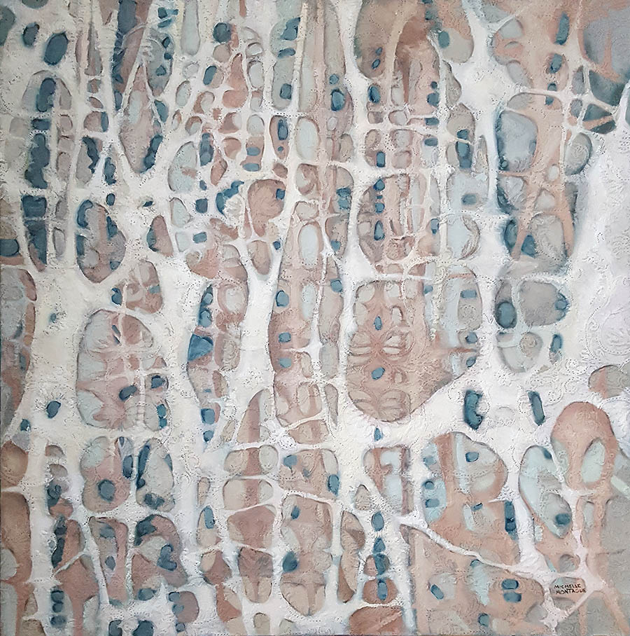
Mere Bodies or Something More? (July 2018 – August 2018 ) In life, we think of our experiences thus far, and what the future holds for us. But when faced with our own mortality, we think of things we took for granted, and what else we could’ve done better. Health is often the catalyst for change, leading us to question life, death and thereafter.
Regardless of lifestyle, the body seems to have a language of its own which manifests through physical, changes. And our transformation takes us from where we were to what we become.
We also share an emotional connection through indirect experiences. Events such as bearing witness to the birth of one life, or grieving the death of another are indirect experiences which allow us to explore the meaning of body as a vessel. “Can we fully comprehend that which makes a body more than just a mere body without the direct experience of its absence?
Mere bodies or something more? is an introspective look at the human body as a physical and spiritual vessel. An interpretation of how one may experience health changes while contemplating mortality and spirituality.

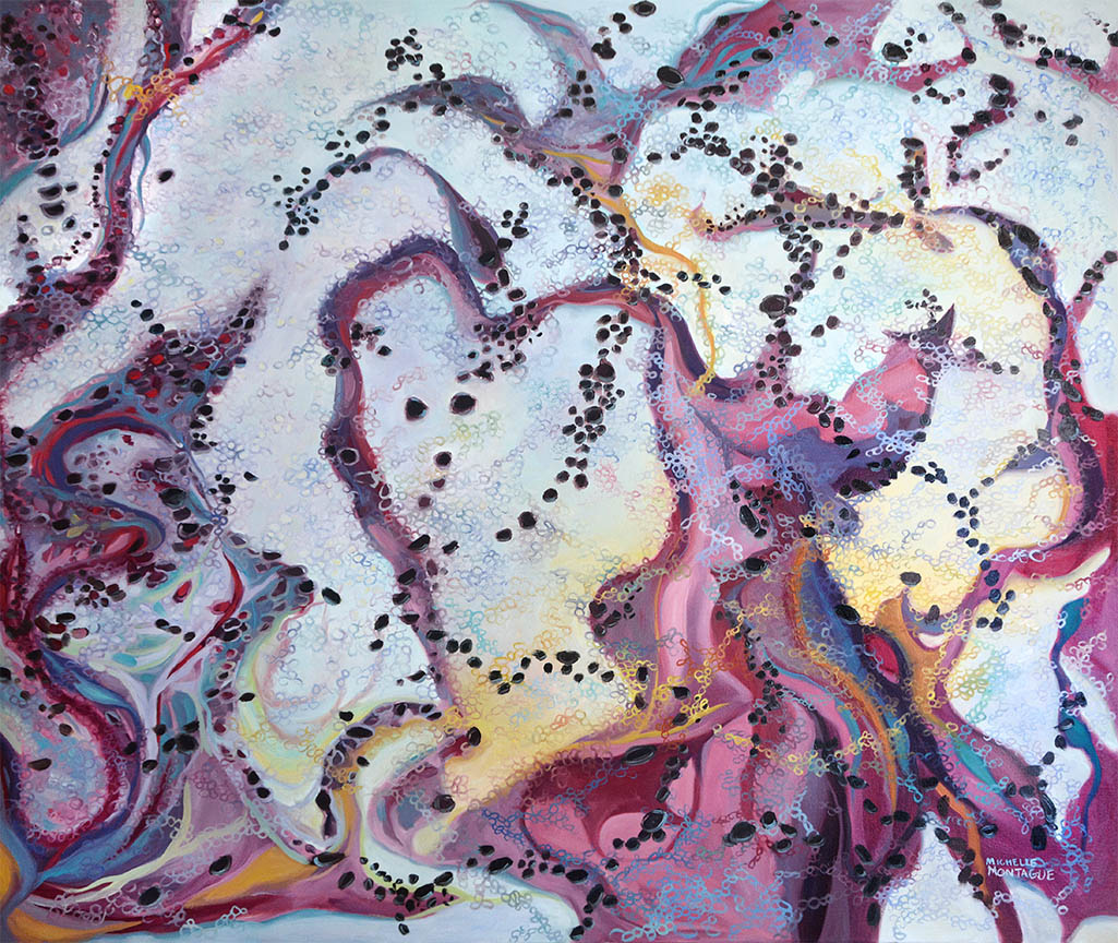
Choosing My Paint Palette
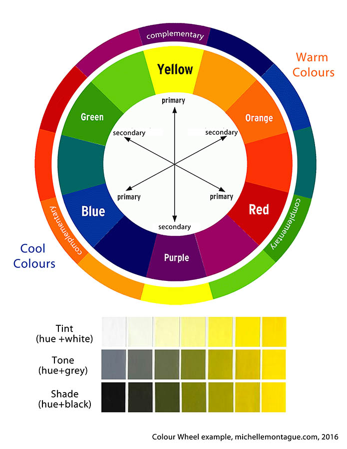
If you search online, or look into any interior design catalogues, go into any paint store etc. you will find 100s if not 1000s of different colours of various shades that are on trend for a particular season. For me, an art supply store with its beautiful array of paint colours is a bit like going into a candy store. Much like candy can rot my teeth an art supply store can rot my wallet, if I’m not careful :-). It’s hard to choose colours inside an art supply store, I mean, do you choose phthalo or ultramarine blue? Cadmium or Hansa yellow? How does an artist decide? Some artists may choose to buy a spectrum of pre-mixed colours to keep in their arsenal and work with as their palette. However, others such as me prefer to mix their own colours and create a palette based on the colours of red, yellow and blue.
In their purest form the hues of Red, yellow, blue or the Primary Colours as they are known can not be created, through the mixing of other colours. All colours in existence are created from mixing any combination of the primary colours. However, this definition only covers the basics of colour mixing and doesn’t take into consideration the tints (lights) tones (greys) or shades (darks) created when you add white or black. If you want to learn more about Colour Theory, I think the Oil Painting Techniques, followed by the Empty Easel are good places to start online. There are also a number of books, which I’ve cited at the end of this post.
Basically my palette only includes a red-based, yellow-based, blue-based colour, white and black. Noticed I mentioned red, yellow and blue based? That’s right; I don’t necessarily use the purest form or hue of the primary colours. I use a tinted or shaded version of red, yellow and blue as my “primary” or base colour then mix my palette from there. I mix any combination of my bases to create the colour I may need and will mix in different amounts of black or white to create the various tints and shades to get a particular colour. I use base colours such as ultramarine blue, alizarin crimson and cadmium yellow since they offer the greatest range for mixing. Temperature is important if you want to achieve colour harmony, so I try to ensure to mix a balance of warm and cool colours in my palette. However in art rules are made to be broken and there are certainly exceptions to colour mixing! But for me, sticking with a limited palette from the start of a project means I can mix any colour I could imagine, put any colour together and the painting will be balanced. This has been my experience and I’ve been using this approach for over 15 years.
Um… why mix colours? Why not just buy the colour you need?
A friend of mine has asked me this question several times. My tongue-in-cheek response to her has always been “because I’m old-school”! But in all seriousness there are a number of reasons why I prefer to mix my own colours:
- It’s more cost-effective. Instead of buying a set of 10-15 pre-mixed colours some of which I may only use once, I can buy three primary-based colours and top-up when needed.
- Space is a premium in my studio. Having only the primary-based colours take up less space on my already crammed shelves.
- I’m not limited to the colours available on the store shelves. Using primary-based colours allows me to mix any colour dreamed of. And if I’m looking for colour inspiration, I refer to my library of colours.
And mostly importantly: - Mixing my own colours has enabled me to become a stronger artist. Over the years I’ve experimented with different techniques and approaches and have learned what works. Mixing my own colours has allowed me to take chances in my artwork. It has also increased my technical knowledge of working with different paint materials and has led me to include different art mediums such as textiles and oil sticks.
I love colour and it’s an important aspect of my work which is why I spend so much time on building and choosing my colour palette. Since my artwork leans towards abstraction, each colour chosen represents for me certain elements found in Nature, which is a key source of inspiration. For example the shades of blue may represent the sky or water. Whereas pinks, violets, yellows which I use often in my work may represent sunsets, or a jellyfish. Also when I think of balance I think of Nature – everything is purposeful, nothing wasted and I like to take this approach to my work.
In summary:
- I mix colours using a red, yellow or blue-based colour,
- Adding black or white to my base colours, expands the range my colour palette.
- Temperature is important to achieving colour harmony in painting, therefore I ensure to mix warm and cool colours in my palette.
- Mixing my own colours to create a palette has added to my technical expertise as an artist and allowed me to experiment with different mediums.
- In my work I choose my colours based on elements seen in Nature. For example, blue=sky, greens=trees plants, oranges and yellow=sunsets etc.
In a later post, will explain how I mix colours to create my palette.
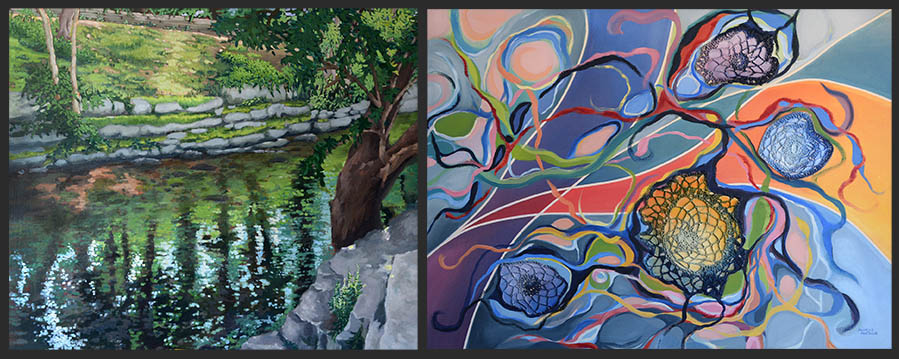
L to R: Sherwood Park (June 2015), acrylic on canvas, Untitled (April 2014), crochet, acrylic, oil stick on canvas. I mixed the primary colours of red, yellow and blue to create these two very different paintings.
Citations in this post:
Using the Color Wheel: Color Theory Tips for Artists and Painters, date accessed March 27, 2016 – The Empty Easel:
Colour Theory For Painters, date accessed March 27, 2016 – Oil Painting Techniques
For further reading on Colour Theory:
Goethe, Johann Wolfgang Von. Theory of Colours. Cambridge, MA: M.I.T., 1970. Print.
Edwards, Betty. Color: A Course in Mastering the Art of Mixing Colors. New York: Jeremy P. Tarcher/Penguin, 2004. Print.
Itten, Johannes, and Ernst Van Haagen. The Art of Color The Subjective Experience and Objective Rationale of Color. New York: Reinhold, 1966. Print.
Itten, Johannes, and Ernst Van Hagen. The Elements of Color a Treatise on the Color System of Johannes Itten Based on His Book The Art of Color. New York: Van Nostrand Reinhold, 1977. Print.