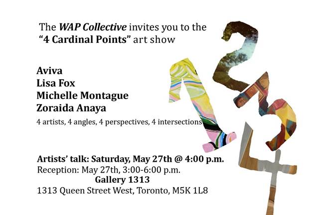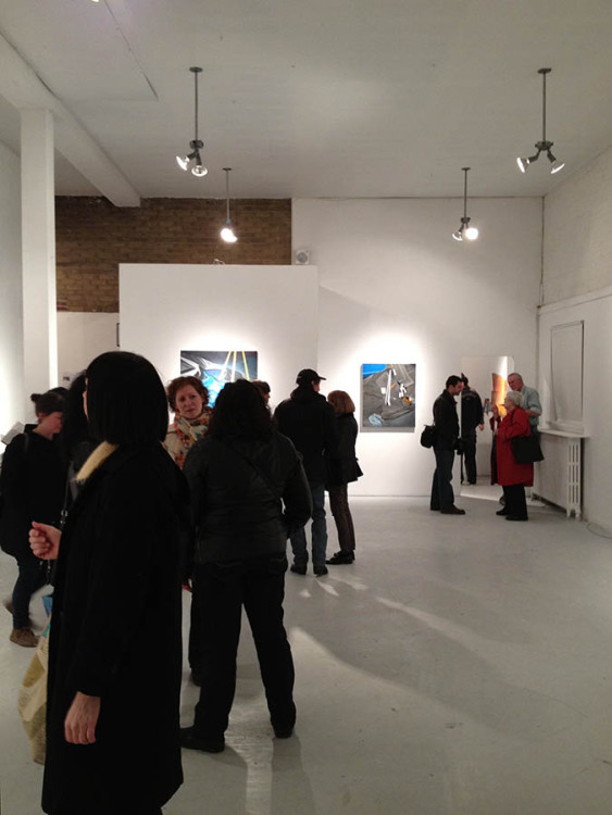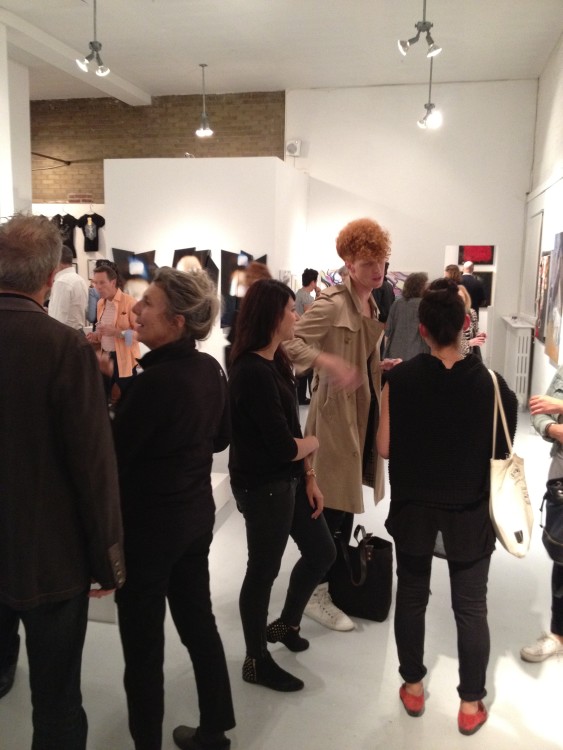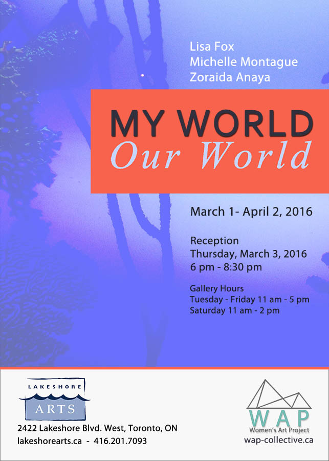
For the month of March, fellow artists Zoraida Anaya, Lisa Fox and I launched our exhibition titled My World, Our World at the Smith Zone Gallery of Lakeshore Arts. The exhibition was part of the Women’s Art Project artist collective, a multidisciplinary and diverse group of women artists. To close the exhibition we were invited to the gallery’s special edition of Open Studio as their guests. An open studio is an event that offers art creators and enthusiasts a fun and supporting environment to discuss and create art. Lakeshore Arts hosts such an event every Friday (unless otherwise noted), from 12-4pm. If you haven’t been to an open studio and are looking for a little inspiration, I highly recommend checking out Lakeshore Arts!
In the session I decided to do an exercise of mixing colours directly on the canvas and thought to share with you my process. In my last post I mentioned that I like to create my palette by mixing the primary base colours of red, yellow and blue. If you want to build your technique in mixing colours then I recommend doing this exercise. If not, then try it anyway just for fun! This exercise will help you:
- create greater colour-harmony and balance in your painting
- think about composition
- learn how to use warm and cool colours effectively to create contrast
- become familiar with working with your paint medium, giving you greater control
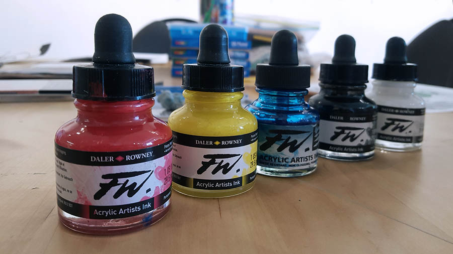
I used inks because they’re fluid and easy to blend making them ideal for this exercise. However you can use any paint medium such as acrylics, watercolours, oils etc… In fact, I repeat this exercise using different mediums to build strength in working with them. Now with that said, let’s paint!
What you need:
- A red, yellow and blue based paint, black and white (Ink, or soft-bodied acrylic paint)
- Brushes: If using acrylic paints a round soft bristle synthetic brush will work. For inks, a natural bristle calligraphy brush, bamboo or Chinese ink brush will work best.
- Cold-pressed paper, canvas or canvas board
- Water container for rinsing brushes and re-wetting paint
- Paper towels for wiping excess paint off brush if needed
Note: If using heavy-bodied (thick) acrylic paints, you will need 5 small containers (one for each colour) to thin out your paint with a little water.
Since we are actually mixing the colours directly on the paper or canvas, we will not need to pre-mix the colours on a paint palette.
For this exercise I’m using Daler and Rowney Acrylic Artist’s Ink: Process Magenta, Process Yellow, Prussian Blue (Hue), Black and White.
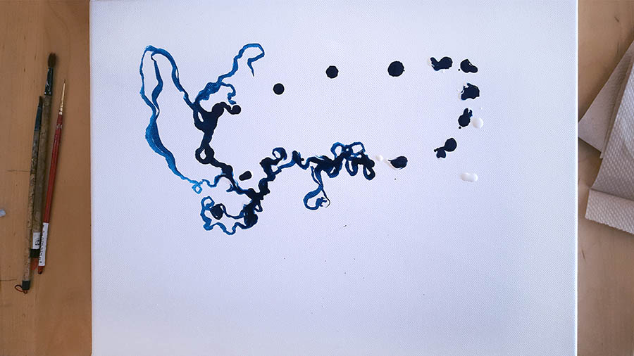
Step 1
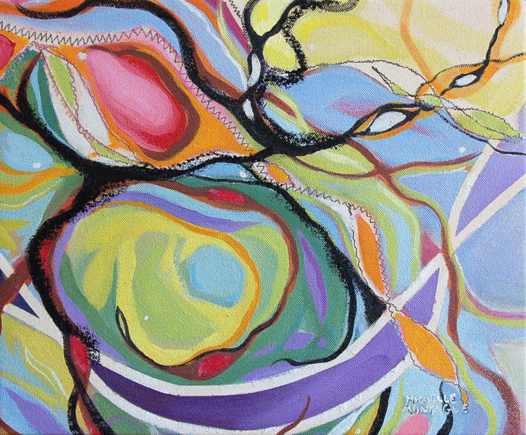
Starting with the colour, drip the blue ink/paint directly on the paper or canvas. Then drip white ink/paint over the blue.
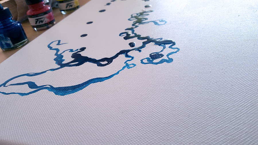
A view on the side so you can see how thin the ink is.
Step 2
While the ink/paint is still wet, with the tip of the brush start to slowly “swirl” the white ink/paint into the blue in various directions. Afterwards add drips of red and start to “swirl” that into the blue. You can also drip a little more white. As you start to swirl red into blue, you may begin to notice various shades of purples. With the additional white you will get various tints of blues and pinks.
This exercise requires a light touch with the brush. Therefore, don’t over mix the colours. Work with the tip of the brush and loosely swirl one colour into the other. During this process you want to pay attention to how the primary colours mix to create other colours on the paper/canvas.
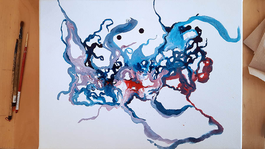
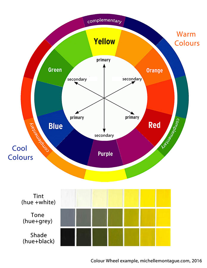
Red and blue mixed together will create purple, which is a secondary colour. Notice when white is added light blues, purples and pinks are created? These lighter shades are called tints.
Step 3
While the ink/paint is still wet start to drip in yellow and begin to swirl the colour into the red and blue. Depending on where you place the yellow, you should begin to see green or orange form. Yellow and blue will create green, while yellow and red will create orange.
At this point the ink/paint may begin to dry. You can keep adding drips of red then yellow, then blue in stages, slowly swirling them together to create as many colours as you can. Adding in drips of white will give you a lighter/tint of a colour. You can also add drips of black, to get a darker/shade of a colour. Black will also create contrast. You can also swirl black with white to create shades of grey. Pay attention to how the various colours are created. Also notice the how light and dark colours lay next to each other. Continue building up the layers until you’re satisfied with the result.
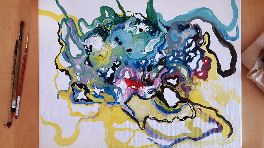
Notice how the primary colours; red, yellow and blue are mixed together to create the other colours.
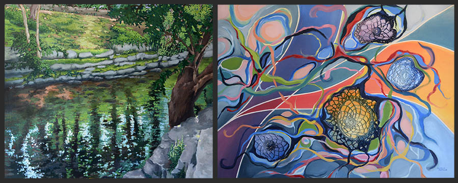
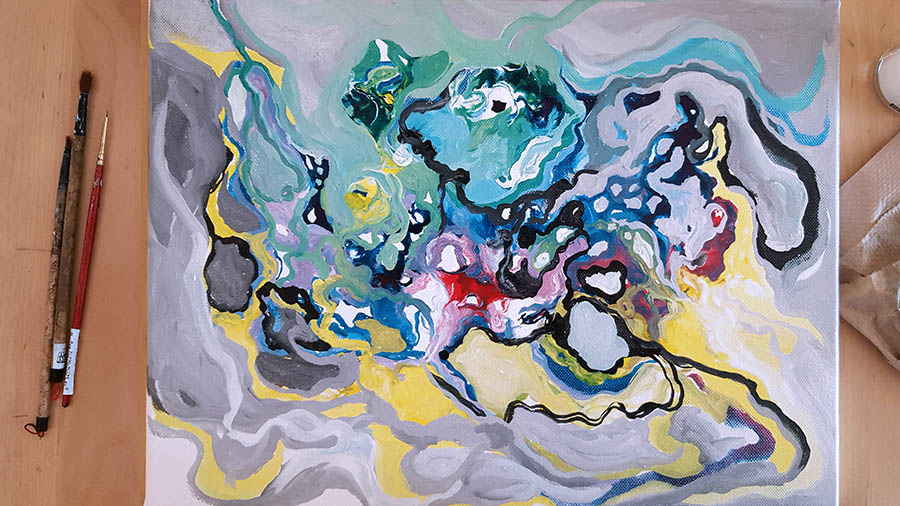
Final result
At the end of this exercise, I usually ask myself:
- How many colours was I able to create by doing this exercise?
- Do the dark and light colours create contrast?
- Is there balance in the shapes of the swirls?
There are no definitive answers to these questions. They are only guidelines to help me think about colour harmony, balance and composition.
I recommend doing this exercise numerous times until you are comfortable with blending and mixing colours. This exercise will not only build your technique as a painter but you’ll get a different result each time.
Enjoy!
Learning how to mix the primary colours will help you understand colour harmony, balance and composition. It will also help you use warm and cool colours effectively to achieve contrast.
Filed under: Blog by Michelle
No Comments »