If you search online, or look into any interior design catalogues, go into any paint store etc. you will find 100s if not 1000s of different colours of various shades that are on trend for a particular season. For me, an art supply store with its beautiful array of paint colours is a bit like going into a candy store. Much like candy can rot my teeth an art supply store can rot my wallet, if I’m not careful :-). It’s hard to choose colours inside an art supply store, I mean, do you choose phthalo or ultramarine blue? Cadmium or Hansa yellow? How does an artist decide? Some artists may choose to buy a spectrum of pre-mixed colours to keep in their arsenal and work with as their palette. However, others such as me prefer to mix their own colours and create a palette based on the colours of red, yellow and blue.
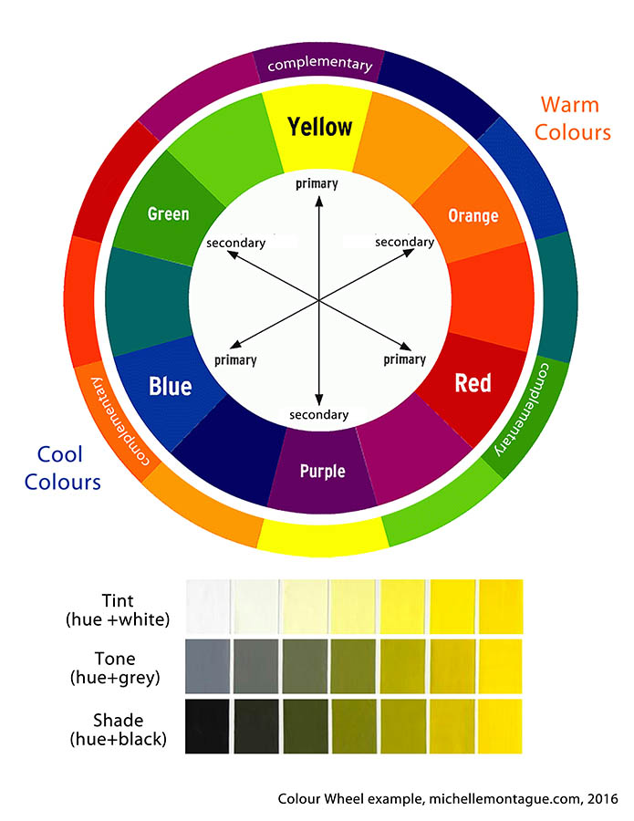
In their purest form the hues of Red, yellow, blue or the Primary Colours as they are known can not be created, through the mixing of other colours. All colours in existence are created from mixing any combination of the primary colours. However, this definition only covers the basics of colour mixing and doesn’t take into consideration the tints (lights) tones (greys) or shades (darks) created when you add white or black. If you want to learn more about Colour Theory, I think the Oil Painting Techniques, followed by the Empty Easel are good places to start online. There are also a number of books, which I’ve cited at the end of this post.
Basically my palette only includes a red-based, yellow-based, blue-based colour, white and black. Noticed I mentioned red, yellow and blue based? That’s right; I don’t necessarily use the purest form or hue of the primary colours. I use a tinted or shaded version of red, yellow and blue as my “primary” or base colour then mix my palette from there. I mix any combination of my bases to create the colour I may need and will mix in different amounts of black or white to create the various tints and shades to get a particular colour. I use base colours such as ultramarine blue, alizarin crimson and cadmium yellow since they offer the greatest range for mixing. Temperature is important if you want to achieve colour harmony, so I try to ensure to mix a balance of warm and cool colours in my palette. However in art rules are made to be broken and there are certainly exceptions to colour mixing! But for me, sticking with a limited palette from the start of a project means I can mix any colour I could imagine, put any colour together and the painting will be balanced. This has been my experience and I’ve been using this approach for over 15 years.

Um… why mix colours? Why not just buy the colour you need?
A friend of mine has asked me this question several times. My tongue-in-cheek response to her has always been “because I’m old-school”! But in all seriousness there are a number of reasons why I prefer to mix my own colours:
- It’s more cost-effective. Instead of buying a set of 10-15 pre-mixed colours some of which I may only use once, I can buy three primary-based colours and top-up when needed.
- Space is a premium in my studio. Having only the primary-based colours take up less space on my already crammed shelves.
- I’m not limited to the colours available on the store shelves. Using primary-based colours allows me to mix any colour dreamed of. And if I’m looking for colour inspiration, I refer to my library of colours.
And mostly importantly: - Mixing my own colours has enabled me to become a stronger artist. Over the years I’ve experimented with different techniques and approaches and have learned what works. Mixing my own colours has allowed me to take chances in my artwork. It has also increased my technical knowledge of working with different paint materials and has led me to include different art mediums such as textiles and oil sticks.
I love colour and it’s an important aspect of my work which is why I spend so much time on building and choosing my colour palette. Since my artwork leans towards abstraction, each colour chosen represents for me certain elements found in Nature, which is a key source of inspiration. For example the shades of blue may represent the sky or water. Whereas pinks, violets, yellows which I use often in my work may represent sunsets, or a jellyfish. Also when I think of balance I think of Nature – everything is purposeful, nothing wasted and I like to take this approach to my work.
In summary:
- I mix colours using a red, yellow or blue-based colour,
- Adding black or white to my base colours, expands the range my colour palette.
- Temperature is important to achieving colour harmony in painting, therefore I ensure to mix warm and cool colours in my palette.
- Mixing my own colours to create a palette has added to my technical expertise as an artist and allowed me to experiment with different mediums.
- In my work I choose my colours based on elements seen in Nature. For example, blue=sky, greens=trees plants, oranges and yellow=sunsets etc.
In a later post, will explain how I mix colours to create my palette.

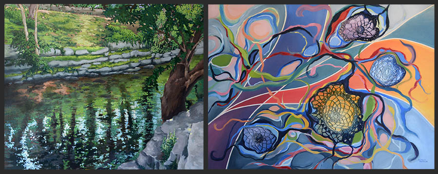
L to R: Sherwood Park (June 2015), acrylic on canvas, Untitled (April 2014), crochet, acrylic, oil stick on canvas. I mixed the primary colours of red, yellow and blue to create these two very different paintings.
Citations in this post:
Using the Color Wheel: Color Theory Tips for Artists and Painters, date accessed March 27, 2016 – The Empty Easel:
Colour Theory For Painters, date accessed March 27, 2016 – Oil Painting Techniques
For further reading on Colour Theory:
Goethe, Johann Wolfgang Von. Theory of Colours. Cambridge, MA: M.I.T., 1970. Print.
Edwards, Betty. Color: A Course in Mastering the Art of Mixing Colors. New York: Jeremy P. Tarcher/Penguin, 2004. Print.
Itten, Johannes, and Ernst Van Haagen. The Art of Color The Subjective Experience and Objective Rationale of Color. New York: Reinhold, 1966. Print.
Itten, Johannes, and Ernst Van Hagen. The Elements of Color a Treatise on the Color System of Johannes Itten Based on His Book The Art of Color. New York: Van Nostrand Reinhold, 1977. Print.